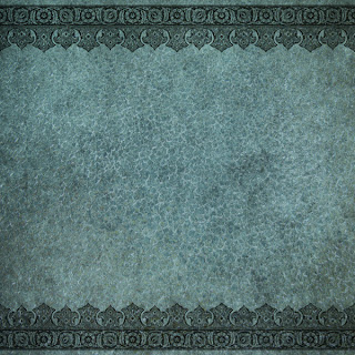
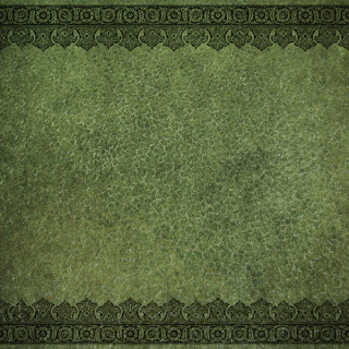
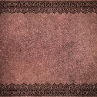
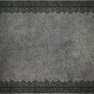
Part 5 - Fancy Border Mosaic Paper Set from my EKD "Old World Charm" digital collection
This set includes the 4 coordinating papers and the Gray Tone paper template that can be used as is or to create other color pages with a digital computer program like Photoshop.
 |
| EKD Fancy Border Mosaic Paper Set - part of my "Old World Charm" digital collection |
I like to have a ready to use stash of coordinating supplies when I'm working digitally.
Yes, it's fun to create my own from scratch or have a template that can be colored as I choose
but there are times I want quick and easy selections.
I created the Fancy Border Mosaic pattern to reflect my Spanish roots with the look
of ironwork, Moorish patterns and tile work. The colors for the four papers are based on the focal colors from the pallet I used when designing my "Old World Charm" digital collection.
There is also one paper in Gray Tone so it can be used "as is"
or a digital color layer can be applied so it can be tinted at a later time
as needed to match any project I'm working on.
 |
This is the color palette I decided on when I designed my
"Old World Charm" digital collection |
I used the darkest value in each color family to create the 4 pages
in the Fancy Border Mosaic Paper Set
Fancy Border Mosaic Paper Set
part of my "Old World Charm" collection
 |
| EKD Fancy Border Mosaic Paper - Antique Blue |
 |
| EKD Fancy Border Mosaic Paper - Moss Green |
 |
| EKD Fancy Border Mosaic Paper - Golden Brown |
 |
| EKD Fancy Border Mosaic Paper - Desert Rose |
 |
| EKD Fancy Border Mosaic Paper -Gray Tone Paper Template |
How I use the template in Photoshop.
I know there are lots of ways to use Photoshop or other digital editing programs
but for simplicity I'm just showing how I opted to colorize this gray tone template.
I wanted a Plum colored version of this paper so
I began by opening a new page via File - New at the top of my Photoshop toolbar.
I named my new document Fancy Border Mosaic - Plum
and selected all my sizing parameters for a 12 x 12 page
I then used the File - Place option from the top tool
and selected my gray tone template which pop up right on my work area.
I then created a "New Layer" using the last icon at the lower right
of the layers pallet area - it looks like a square with a flipped up corner.
Once the New Layer was active I searched for a shade of purple
that I wanted to use from the color selector on the far left tool bar
I chose color code 5d4774 for my "Plum" paper.
I used the paint bucket tool on the far left tool bar and clicked on my work area.
This made the whole area a sold purple, so I changed my blending mode to the Overlay setting, which allowed my pattern to show through and give me a new colored page to add to my collection.
Bonus Paper in Dark Plum
 |
This is the new EKD Fancy Border Mosaic - Plum
I just created by using the gray tone template |
I created my Paper Template as png files since they are slightly transparent.
This allows you to add a color layer below rather than on top
to get a slightly different look.
Plum Paper #2
 |
EKD Fancy Border Mosaic - Plum created by adding the color layer
under the template in Photoshop rather than over the template;
however I had to change the color code to 470988 to get the right tint |
This 2nd color option was achieved by placing the new layer below
the template on the layers pallet in Photoshop.
I had to change the color code to 470988 which is a much brighter purple and I also changed the
blending mode to normal. Due to this paper template having a low transparency value more muted
colors do not work well as an under layer but when you dial up the color intensity you get a great
paper that shows more detail and more subtle color variations than when you add the color layer over
the template. Its all a matter of playing around with various layer positions and blending
selections to see what you can come up with.
 |
This screen shot shows where I used color code 5d4774 from the first Plum Paper
and dropped the color layer under the template.
Even with the color mode set to Normal the color is a more
muted shade and can't fight up through the template |
 |
Here I selected an much brighter purple and now I have a great plum paper.
The template tones down the brightness of color code 470988 to give me
a rich antique plum and by using the color layer under the template
I retain all the minute details of the template and I also get a bit of
variegation to my color through the page |
Choosing colors and blending modes in Photoshop is part of the fun
in the creative process for me and this gray scale template can come in quite handy
in a pinch; however I did hold onto the original Photoshop psd file when I created the
original template since I get a slightly different look when I add color through
the layers in the psd than when I add it directly to the template.
This way I have two options when I've created a template myself.
The images in this collection are sized for digital scrapbooking.
to my blog so others can join in the fun. Many Thanks!
As Always...


